BRANDING
ILLUSTRATOR
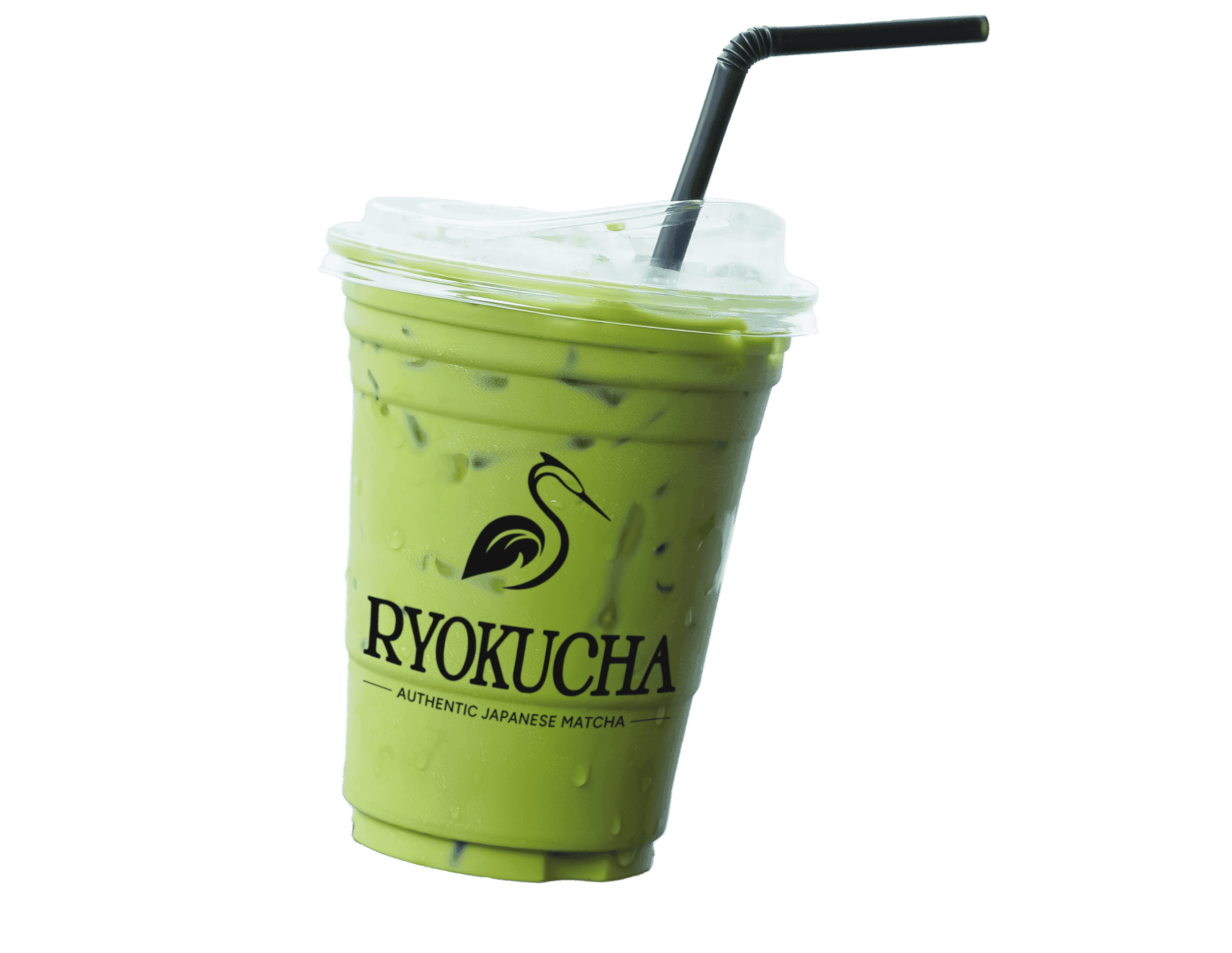
SOLO PROJECT
MAR 2026
CONTEXT
Ryokucha is a conceptual rebrand for a contemporary matcha café. My goal was to explore how I could balance warmth and cultural influence, while aligning with the café's clean and modern aesthetic.
PROBLEM
MY ROLE
Research café goals, then develop a brand logo suite to create a cohesive visual identity across signage, digital fronts, and packaging.
OBJECTIVES
Create an elegant, calm, and warm visual identity that bridges traditional and modern aesthetics.
Develop a flexible design system across packaging and digital mediums.